Tuesday, January 30, 2018

"Same Sky" Art Journal Page

Good afternoon everyone

Well it has certainly cooled down here in Adelaide. We made it through the run of 42 degree days without our air conditioner. The new one is being installed today.

I must admit that the hot weather did make me feel very lazy and I have not done much in the way of craft for a few days now.

I did manage to finish this double art journal page so I would like to share it with you.


The background is another one of those that were in my art journal from a class I had done previously and had never got around to doing anything with.

I used Dylusions Ink Spray in Fresh Lime and Lemon Zest and Docrafts Artiste Spritzing Ink in Mint to add some extra colour to the background as it was fairly pale.

There is some texture paste through a stencil, stamping and Viva Inks Gold in the background.


I drew the circles and then coloured them with Gesso. It took several coats of Gesso because the green kept leeching through. I used my Faber Castell Big Brush Markers to colour the stamped flowers along the bottom of the page and to shade around the circles.


The butterflies were die cut from paper I had coloured with Colour Crush powders.After attaching them to the page I once again used my Big Brush Markers to shade around them and colour the bodies. The bodies then got a coat of Glossy Accents

The title which reads "We all live under the same sky, but we don't all have the same horizon" was treated the same as the butterflies.

Detailing was added using a black fine line marker and a white Signo pen.

I then added a black and white border with my big brush markers and some white acrylic paint.

This is the first double page spread I have done, not sure if I will do any more.

Thanks for dropping by
Till next time
Hugs
Julie


Friday, January 19, 2018

Mum layout for Creative Inspiration

Good Morning

It is as hot as Haidies here today, supposed to get to 41 but could get higher. I am going into town to have lunch with my daughter so I will have to brave the elements

I am sharing a layout I did for the Mini Crop over at Creative Inspiration. There are multiple themes but mine is Family, pretty easy really because most of our scrapping is about family.

I have created an interactive page about my Mother, The main picture shown on the front of the layout opens up to show various photos of her during her life stages.

I have used various paper manufacturers in this layout as I want to use up papers from my stash to get rid of as much as I can. I have also used some gold printed velum, some die cuts and some fabric flowers from Kaisercraft.


Why not pop over to Creative Inspiration and have a go.

Thanks for dropping by
Till next time
Hugs
Julie

Saturday, January 13, 2018

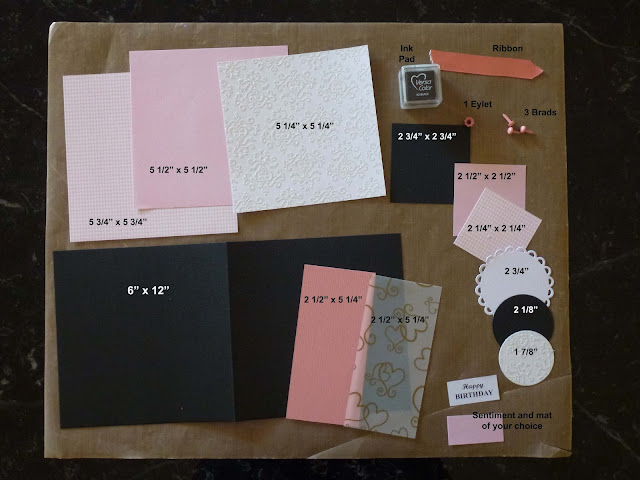
Birthday card tutorial for Off The Rail Scrapbooking

Hi and welcome to my blog

I am sharing a tutorial I did for Off The Rails Scrapbooking. You can check out that post here.

This is the card I made for my Mum for her 85th birthday on Christmas Eve.


This is what you are going to need to create this card


Score and fold the black cardstock at 6" to make a 6" x 6" card base

Using the 5 1/4" x 2 1/2" pieces of cardstock and velum, mark down from the top 1/2" and in from the sides 1/2" and cut the corners off to make a tag shape.

Attach the velum to the cardstock. I used glue behind the pattern on the velum to do this so it would not show through the velum


Ink the edges of all your papers.

Using your Crop-o-dile, or similar, attach your eyelet to the tag.

Thread the ribbon through and secure in place. I have used a staple because my ribbon was very short but you could tie it off if you have longer ribbon.


Attach the 5 1/2" piece of cardstock centrally to the 5 3/4" piece of patterned paper

Then attach the 5 1/4" piece of patterned paper on top of the 5 1/2" piece


Using the square pieces of paper, attach the 2 1/2" piece centrally on top of the 2 3/4" piece and the 2 1/4" piece on top of that.


Layer the scalloped circle and the circles as shown


Assemble your greeting. I have made my greeting mat 1/4" wider and longer than the greeting


These are the items you should now have.


Attach the tag to the larges square assembly 1/2" from the left hand edge and 1/2" from the bottom edge.

I found that I had to use glue to do this as the d/s tape did not want to stick to the glittered paper I had used.


Take the small square assembly and run it through your Big Shot (or similar) with an embossing folded to add a little bit of dimension.


Attach this to your card panel 1 1/2" from bottom and 7/8" from right hand edge


Attach the circle assembly 3/4" from the bottom and 1 1/4" from the left edge using foam tape.


Attach sentiment in a suitable place according to your sentiment size. I have stuck mine 1 3/8" from the bottom and 1 1/2" from the right hand edge.


Add brads to the top right hand corner approx 1/2" apart.

Attach the card panel to the card base and you are done.

If you used a dark colour for your card base you may want to add a light coloured card to the inside of the card so you can write your message. I will write my message using a white gel pen.


Hope you have found this tutorial interesting and I would love to see your makes if you decide to give it a try

Till next time
Hugs
Julie

Monday, January 8, 2018

Don't Forget to Fly Art Journal Page

Welcome back to my blog.

Today I am sharing an art journal page I created using another background from some years ago.
It seems I have quiet a few of these pages that have got backgrounds created and nothing else done to them. Some I like some I don't so I plan on working my way through these and trying to turn them into something I like and am happy to share with you.

So this is how the finished page looks


This was a double page spread. This is the other page which has not been touched so this is basically what I started with for this page.


The tree was created using Impasto Medium coloured with Cocoa Brown acrylic paint. I applied it very thickly and texturised it with my palette knife to give that bark look. I then gave it a coat of black watercolour paint which I wiped off of the high parts leaving it in the creases. I used my Faber Castell Big Brush marker in Green Gold over the top of the tree then some Adirondack acrylic paint in Pearl here and there for a bit of a highlight. I used Faber Castell Big Brush marker in Raw Umber to shade around the tree and an Artline fine point permanent marker for the fine detail

The white circles in the background are made with a couple of different sized caps dipped into white acrylic paint.

To make the birds I applied Color Crush powders randomly on some watercolour paper. The colours I used are Pineapple, Wheat Grass and Blue Heaven.

When that was dry I stamped the birds using the Dina Wakley Scribbly Birds stamp that I have been dying to use ever since I bought it.  I cut them out and attached them to the page using Matte Gel Medium.

For a bit of sparkle, which you can not really see in the photos, I added some Kiwi Smooch to the green bird and some Guatemalan Green Silks to the turquoise bird. Detailing was done with the same Artline black pen and a white gel pen.

The hand drawn boarder was coloured using a black Artline marker and a white Pilot permanent marker.

The title was printed on my printer then coloured with Dylusions Ink Sprays in Squeezed Orange, Lemon Zest and Bubblegum Pink. White gel pen to highlight the "FLY" section.

Well that is a very long post.
If you have stayed with me, Thank you

Thanks for dropping by
Till next time
Hugs
Julie

Thursday, January 4, 2018

Art Journal Page - Appreciate

Hi there.

Tonight I am sharing an art journal page that was very quick to create.

The reason it did not take me long was because the bulk of the page was completed a couple of years ago - that is the colourful part. I did that in a class and was not that impressed with it so I decided to cover most of it up and just leave the pattern showing through as flowers.

I have seen this technique on several different youtube clips and have always liked it so this was my opportunity to kill two birds with one stone.


I cannot remember what was used for the original page but I can remember we did an image transfer on it that was not so successful.

To the already coloured page I added some Texture Paste through the 13@rts circle stencil.

When the paint was dry I drew the flowers and then covered the background with black acrylic paint.

Once that had dried I rubbed Viva Inks Gold all over it with my finger allowing the black to show through more in some places than others.

With a Zig Writer pen I detailed the flowers with outlining and doodling before I went around the edge of the page with Adirondack acrylic paint "Pearl" dabber. I also used this to lightly wipe over the texture paste in the background.      

I added a Tim Holtz "Big Chat" word to finish the page off.

It is probably a bit too dark for my liking but I am happy with it apart from that.

Unfortunately the original was a double page spread so now I have to work out what to do with the other page.

Thanks for dropping by
Till next time
Hugs
Julie

Wednesday, January 3, 2018

Creative Inspiration Magazine Layouts

Hi there

Today I would like to share a couple of layouts that were published in the January Creative Inspiration Magazine

This edition of the magazine was dedicated to using one of the sketches created by Bev Code who is the Editor/Publisher of the magazine. There were hundreds to choose from.

These are the two layouts I chose to do.

Both of these layouts have a background of Texture Paste coloured with acrylic paint then put through a stencil. The Turquoise paint was actually a metallic paint and has a beautiful metallic shimmer in real life. When they dried they were both brighter than I wanted so I gave them a random spray with White Chalkboard spray to tone them down.

For the top layout I turned the sketch on it's side as I had a portrait photo and the sketch used a landscape one.

The papers for this layout are from a Studio Calico Paper pad called "Best Of".

Some washi tape and Bella Glittered chipboard letters for the title completed the layout. I particularly liked the horizontal strips of paper in the background. A technique I will probably use again.


This layout uses Kaisercraft "Fiesta" patterned paper and collectables for the "Dream Big collection"
Very happy with the way this layout finished up.


Why not go over and check out the other layouts in the magazine. Here is a link
You might find a sketch that you want to try

Thanks for dropping by
Till next time
Hugs
Julie

Tuesday, January 2, 2018

Creative Inspiration January Sketch Challenge


Hi everyone.

Getting good here. Two posts in two days. Look at me go..........

I am sharing a layout I did as part of my DT activities for Creative Inspiration

This is my layout


and this is the sketch


24300926_10156021454916133_2510023805649


The layout is about my Grand-Daughter's first sewing attempt. She actually made a skirt and it was good enough for her to wear. She still has it and wears it occasionally.

Because the layout is about sewing I have done a lot of sewing on the page. The background started with a coat of Gesso then texture paste mixed with glitter through a Kaisercraft circle stencil.

When that was dry I took to the page with some blue water colour.

Next came some stamping with Archival Black Ink. I used a couple of different stamps for this.

Each of the patterned papers were stitched into place with my sewing machine. I have attached a piece of the material that she used to practice sewing on before starting her skirt, which was made of the same fabric.

The scribbly circle and the scalloped circle were cut on my Scan N Cut.
The scalloped circle was cut using plain white cardstock then stamped with the  "Stitched Circles"  stamp by Kaisercraft.

Why not pop over to Creative Inspiration and check out the work by the other DT members and give the sketch a go.

Thanks for dropping by
Till next time
Hugs
Julie


Monday, January 1, 2018

Off The Rails January Challenge


Hi there friends

I am here tonight to share my layout for the Mood-board Challenge over at Off The Rails Scrapbooking.


This is the layout I have created


And this is the mood-board

January Challenge

It's all about babies this month so if you have any baby photos you have been wanting to scrap this is the ideal opportunity to get it done and maybe even win one of the great prizes they have on offer.

I created the photo collage in Photoshop and then had it printed at Officeworks. It is 7" x 5" and shows an assortment of photos of my daughter in her first 9 months. (She is now 44 so they have been waiting for a long time)

The background hearts are created with texture paste coloured with acrylic paint and put through Kaisercrafts "Love Quarters" stencil and a bit of Glimmermist splattered here and there. The papers I used are so old I cannot remember where I got them from or what brand they are. I bought them in a paper pack and threw the packaging away many moons ago.

I have set myself a challenge this year to use as much of my stash as possible and only buy the necessities. Let's see how long that lasts.

All of the chipboard was painted with Gesso and then stamped and doodled around. I also doodled around all of the patterned papers.

Pop over to Off The Rails Scrapbooking and check out the inspiration by the other Design Team members

Thanks for dropping by
Till next time
Hugs
Julie