Good morning.
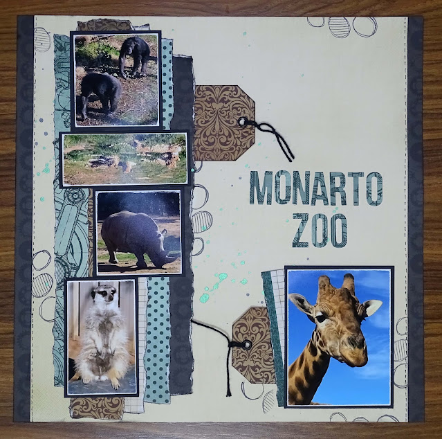
Today's layout features five photos. This is not something I do very often but I have lots of photos of our visit to Monaro Zoo and our "Feeding the Giraffes" experience and I wanted to fit them onto a two page layout.
I reduced the size of my photos and cropped them so only the important parts of the photo were left.
The Giraffe feeding photos will be on the second page of this two page layout.
I have used Kaisercraft Belle Collection - Angel paper for my background.
The other papers I have used are Kaisercraft Time Machine Collection papers.
To create the strips to go under my photos I cut:-
Iron Clad paper - 2" x 12" & 1" x 12"
Mechanism paper - 1 1/4" x 12" & 1 1/4" x 10"
Gadget paper - 1 1/4" x 12"
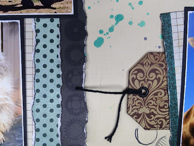
I tore the long edges of each of these strips and inked them using my Versa color Black Ink Cube.
I tore the lengths of each strip so they were staggered before
attaching them to each other so they slightly overlapped.
I attached scrap chipboard behind this panel.
I filed around the edge of each photo and matted them onto black cardstock.
These were also mounted on scrap chipboard.
I used Do Craft's Artiste Spritzing Inks in Mint and Black Night
to splatter lightly on the background cardstock
I also stamped with StayZon Jet Black Ink and a stamp from the
Dylusions Anatomy of a Page stamp set randomly on my background.
I created two tags from the Iron Clad paper, added a black eyelet and some black crochet cotton.
A piece of the Iron Clad patterned paper that had the branding strip attached was cut to 4" x 2", the branding strip edge was torn and inked and attached to the giraffe photo on a slight angle.
Now that all of my elements are ready I attached them to the background.
I die cut he title using Kaisercraft's DD700 Alphabet Upper Case Dies and Mechanism patterned paper.
I used my reverse tweezers and liquid glue to attach the title to the page.
I thought the page need something more so I trimmed the background down to 11" x 12" and added a strip of Iron Clad to the left and right hand edge of the layout to build it back up to 12" square.
A faux stitched line along the left and right hand edge of the cream background finished this layout off.
You can watch me create this page in this video, things do not always go smoothly.
Hope you enjoyed my video
As always, thank you for spending part of your day here with me today
Till next time
Hugs
Julie


No comments:
Post a Comment
Thank you for your comment